New! Make column graphs with AI

New! Make column graphs with AI

Free column graph maker

Free column graph maker

Free column graph maker

Design stunning, interactive column graphs that highlight your data’s story
in seconds — no design skills needed.

Design stunning, interactive column graphs that highlight your data’s story
in seconds — no design skills needed.

Design stunning, interactive double bar graphs that highlight your data’s story in seconds — no design skills needed.

No credit card required

No credit card required

Best free bar graph maker online

Trusted by 100,000+ users from

data-driven teams

Best free column graph generator online

Trusted by 100,000+ users from data-driven teams

Column graph templates

Start with one of our pre-made palettes or create a column graph from scratch.

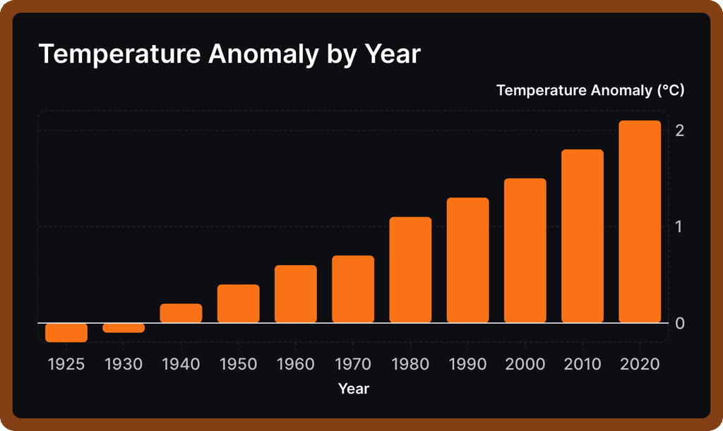
  • Temperature bar graph
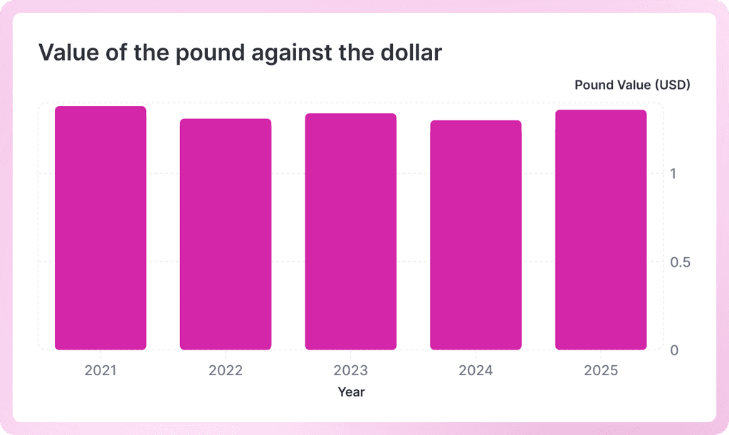
  • Money bar graph
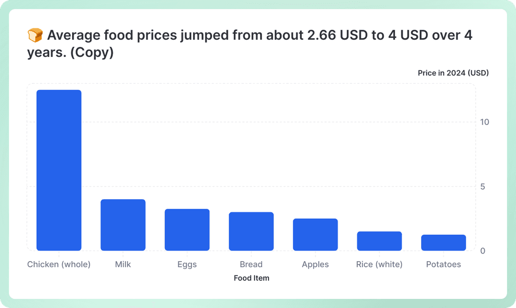
  • Food bar graph
  • Temperature bar graph
  • Money bar graph
  • Food bar graph

Meet Graphy AI

Add your data and Graphy's AI will create a column chart and explain your key insights. Ready to present in slides, or paste into Slack.

AI Line Graph Maker

Meet Graphy AI

Add your data and Graphy's AI will create a column chart and explain your key insights. Ready to present in slides, or paste into Slack.

AI Line Graph Maker

Meet Graphy AI

Add your data and Graphy's AI will create a bar chart and explain your key insights.Ready to present in slides, or paste into Slack.

AI Line Graph Maker

Meet Graphy AI

Add your data and Graphy's AI will create a bar chart and explain your key insights.Ready to present in slides, or paste into Slack.

AI Line Graph Maker

Meet Graphy AI

Add your data and Graphy's AI will create a bar chart and explain your key insights.Ready to present in slides, or paste into Slack.

Meet Graphy AI

Add your data and Graphy's AI will create a bar chart and explain your key insights.Ready to present in slides, or paste into Slack.

Column graph alternatives
  • Line chart maker

    Line

  • Heatmap maker

    Heatmap

  • Bar and line graph maker

    Combo

  • Pie chart maker

    Pie

  • Data table chart maker

    Table

  • Funnel maker

    Funnel

1. Upload or paste your data

Add your data by typing directly into the data table or copying from tools like Google Sheets or Excel. Graphy even supports connecting to Google Sheets directly for data syncing.

Upload or paste your data

2. Customize the design

Personalize your bar graph with themes, custom colors, and powerful annotations to highlight key insights. Add elements like headline numbers, trend lines, and goal markers to make your data more meaningful and engaging.

Customize the design and add annotations

3. Invite your coworkers to collaborate

Share your bar graph projects with team members for real-time collaboration and feedback. Give your colleagues access to view, edit, and contribute to your visualizations.

Invite your coworkers to collaborate

4. Export or embed your bar graph

Present your data live with a beautiful presenter mode or share your bar graph through interactive embeds in tools like Notion, Canva, or ClickUp. Export high-quality versions of your charts as images for use in presentations or reports.

Export or embed your double bar graph

How to make a bar graph online for free with Graphy

How to easily make a column graph online for free with Graphy

Upload or paste your data

Wall of love

Graphy's rating is

on

Cindy Ibanez

Global Head of Marketing at

Wynwood House

Thanks to Graphy 5 days of reporting were done in 4 hours. My team were in love! They were like, oh my God, what is this, this is the future!

Guillermo Rauch

CEO at Vercel

Stunning product.

Tim Chong

Co-founder and CEO at Yonder

Graphy has been game changing in helping our team build beautiful graphs without the hassle of formatting in Excel. We use it for our internal reporting and board memos, it's super easy to make graphs in seconds.

Joe Edwards

Senior Growth Marketing

Manager at Venafi

Most other data tools are passive and leave it up to the stakeholders to interpret the numbers.

Graphy helps you create stunning charts from disparate sources with the context and commentary your stakeholders need.

Jakob Knutzen

CEO & Co-Founder at Butter

Graphy allows me to make beautiful, super customized charts. This makes my communications of numbers to both investors and team much clearer. Plus it's just fun to use 😊

Stan Massueras

General Manager at Lattice

Great ideas are only impactful when communicated clearly.


Graphy enabled us to transform data into compelling stories, and those stories into meaningful action.

Mitchell Croft

Finance Director at

Made Thought

Switched from presenting boring excel tables to using Graphy

Ryan Hoover

Founder of Product Hunt

I’d rather eat cardboard than create another pivot table Thanks, Graphy (I don’t like cardboard)

FAQ

When should you use a column graph?

Column graphs are perfect when you want to compare different categories or show how something changes over time. Think of them as your go-to choice when you have distinct groups to compare - like sales figures across different months, survey responses by age group, or performance metrics between teams. They're especially great when you have a moderate number of categories (usually 2-12) and want your audience to quickly spot differences and trends. If you're looking to create professional column graphs that really pop, Graphy makes it super easy to build beautiful, actionable charts that help drive decisions and keep everyone aligned.

What is the difference between a bar graph and a column graph?

The main difference is simply orientation! Column graphs have vertical bars that go up and down, while bar graphs have horizontal bars that go left to right. It's really that straightforward - they show the same type of information, just rotated. You'll typically see column graphs when categories are short (like months or product names) and bar graphs when you have longer category labels that would be cramped if written horizontally.

What is another name for a column graph?

Column graphs are also commonly called "column charts," "vertical bar charts," or simply "bar charts" (though technically bar charts are horizontal). Some people also refer to them as "column plots" in more technical contexts. The terms are pretty much interchangeable in everyday use - most people will know what you mean regardless of which name you use.

What are column graphs best used for?

Column graphs shine when you need to compare quantities across different categories or track changes over time periods. They're fantastic for showing things like monthly sales figures, survey results by demographic, budget allocations across departments, or performance metrics over quarters. They work best when you want viewers to easily compare heights and spot patterns, trends, or outliers at a glance.

How do you interpret a bar chart?

Reading a column graph is pretty intuitive - just look at the height of each column! The taller the column, the higher the value. Start by checking the vertical axis (y-axis) to understand what's being measured and the scale, then look at the horizontal axis (x-axis) to see what categories you're comparing. Compare column heights to spot which categories are highest or lowest, look for patterns or trends if the data is over time, and pay attention to any significant differences between columns.

Do column graphs have gaps?

Yes, column graphs typically have gaps between the columns, and that's actually important! These gaps help separate each category visually, making it clear that you're looking at distinct, separate groups rather than continuous data. The gaps make the chart easier to read and prevent the columns from blending together.

Sign up for free

Join over 100,000 teams who use Graphy
to drive action with their data.

Graphy

Graphy enables anyone to become a skilled data storyteller, by radically simplifying the way data is presented and communicated. 

Graphy Technologies Ltd. 2025. All rights reserved

Graphy

Graphy enables anyone to become a skilled data storyteller, by radically simplifying the way data is presented and communicated. 

Graphy Technologies Ltd. 2025. All rights reserved

Graphy

Graphy enables anyone to become a skilled data storyteller, by radically simplifying the way data is presented and communicated. 

Graphy Technologies Ltd. 2025. All rights reserved