Free line graph maker
Design stunning, interactive line graphs that highlight your data’s story in seconds — no design skills needed.
No credit card required
No credit card required


Use cases
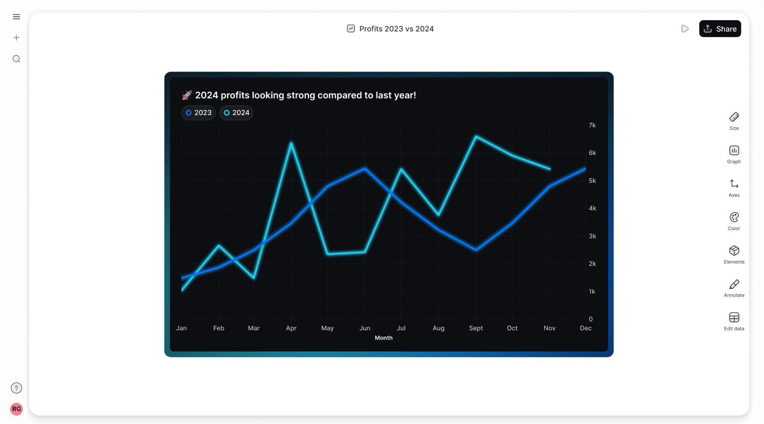
When to use a line graph
Line graphs are the perfect choice when you want to track how something changes over time.


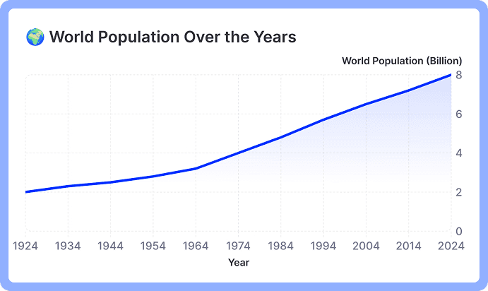
Spot Trends
Visualize how a metric changes across a timeline - like monthly sales figures, daily website traffic, or population growth over years.
Visualize how a metric changes across a timeline - like monthly sales figures, daily website traffic, or population growth over years.
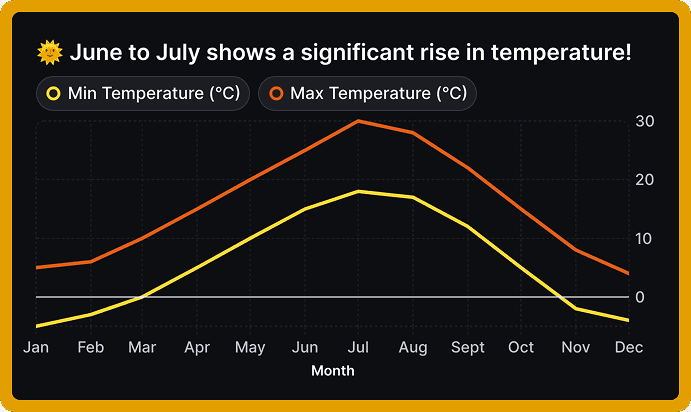
Find Critical Points
Identify the peaks, valleys, and turning points in your data - like pinpointing your peak energy hours during the day, finding the busiest hour at a coffee shop, or spotting exactly when your website traffic started to drop. A line graph makes these key moments jump out visually.
Identify the peaks, valleys, and turning points in your data - like pinpointing your peak energy hours during the day, finding the busiest hour at a coffee shop, or spotting exactly when your website traffic started to drop. A line graph makes these key moments jump out visually.
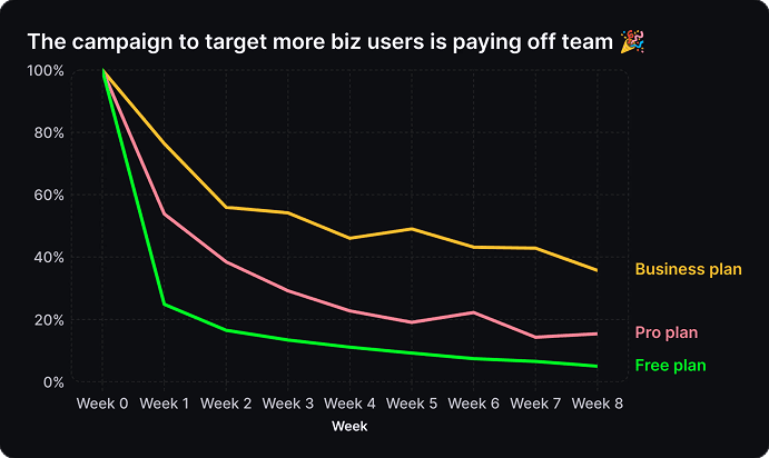
Identify Anomalies
Spot recurring patterns, seasonal trends, or unusual events in your data. You might notice your electricity usage always goes up in winter, or spot an unusually high water bill that needs checking.
Spot recurring patterns, seasonal trends, or unusual events in your data. You might notice your electricity usage always goes up in winter, or spot an unusually high water bill that needs checking.


Line graph templates
Start with one of our pre-made palettes or create a
line graph from scratch.
Start with one of our pre-made palettes or create a
line graph with multiple lines from scratch.


Meet Graphy AI
Add your data and Graphy's AI will create a line chart and explain your key insights.
Ready to present in slides, or paste into Slack.

Meet Graphy AI
Add your data and Graphy's AI will create a line chart and explain your key insights.
Ready to present in slides, or paste into Slack.
1. Upload or paste your data
Add your data by typing directly into the data table or copying from tools like Google Sheets or Excel. Graphy even supports connecting to Google Sheets directly for data syncing.

2. Customize the design
Personalize your line graph with themes, custom colors, and powerful annotations to highlight key insights. Add elements like headline numbers, trend lines, and goal markers to make your data more meaningful and engaging.


3. Invite your coworkers to collaborate
Share your line graph projects with team members for real-time collaboration and feedback. Give your colleagues access to view, edit, and contribute to your visualizations.

4. Export or embed your line graph
Present your data live with a beautiful presenter mode or share your line graph through interactive embeds in tools like Notion, Canva, or ClickUp. Export high-quality versions of your charts as images for use in presentations or reports.

How to make a line graph online for free with Graphy
How to easily make a line graph online for free with Graphy
Wall of love
Trusted by 300,000+ data storytellers

Cindy Ibanez
Global Head of Marketing at Wynwood House
Thanks to Graphy 5 days of reporting were done in 4 hours.
My team were in love! They were like, oh my God, what is this, this is the future!

Joe Edwards
Senior Growth Marketing Manager at Venafi
Most other data tools are passive and leave it up to the stakeholders to interpret the numbers
Graphy helps you create stunning charts from disparate sources with the context and commentary your stakeholders need.

Stan Massueras
General Manager at Lattice
Great ideas are only impactful when communicated clearly.
Graphy enabled us to transform data into compelling stories, and those stories into meaningful action.

Ryan Hoover
Founder of Product Hunt
I’d rather eat cardboard than create another pivot table Thanks, Graphy (I don’t like cardboard)

Nick Lafferty
Founder at Early Exit Club
Graphy is the first tool I use when I'm looking to quickly create stunning visuals for my newsletter, social feeds, and my consulting business. I'm not stuck using Google Sheet's terrible default graphs anymore!

Liam Shalon
Director of Research and
Development at Level Ventures
Most of the BI/internal tools we have for generating reports suck so bad that it’s embarrassing. Graphy is one of the few tools in the space for visualizing data that ‘just works’.

Joe Tyndall
Head of Finance at Seedcamp
Few things get me as excited as beautiful charts do. Graphy has transformed the way we work with data for both internal and external content.
Effortless dashboards all in one place, and the AI features mean we can now produce them rapidly, and keep them updated live.

Neil Gandhi
Founder of Send.co
Graphy creates all my external facing charts.
AI does all the heavy work, and it’s drop dead gorgeous

Michael Cockburn
Founder of Desana
It was a complete game changer when Graphy started to allow me to prompt it for insights, fine tune them, and make beautiful visualizations out the other side.
Feels like the future of storytelling in business.

Mitchell Croft
Finance Director at Made Thought
Switched from presenting boring excel tables to using Graphy

Tim Chong
Co-founder and CEO at Yonder
Graphy has been game changing in helping our team build beautiful graphs without the hassle of formatting in Excel.
We use it for our internal reporting and board memos, it's super easy to make graphs in seconds.

Felix Kuhlmann
Analyst at Antler
Graphy helps me to make sense of our data from multiple sources in one place.

Jakob Knutzen
CEO & Co-Founder at Butter
Graphy allows me to make beautiful, super customized charts. This makes my communications of numbers to both investors and team much clearer.
Plus it's just fun to use 😊

Guillermo Rauch
CEO at Vercel
Stunning product.

David Jarvis
Founder/CEO at Griffin
I’ve been waiting for something like Graphy for nearly twenty years.
Beautiful, insightful, and dead easy to use. I’m obsessed.
Graphy's rating is
on

Wall of love
Trusted by 300,000+ data storytellers
Cindy Ibanez
Global Head of Marketing at Wynwood House
Thanks to Graphy 5 days of reporting were done in 4 hours.
My team were in love! They were like, oh my God, what is this, this is the future!
Joe Edwards
Senior Growth Marketing Manager at Venafi
Most other data tools are passive and leave it up to the stakeholders to interpret the numbers
Graphy helps you create stunning charts from disparate sources with the context and commentary your stakeholders need.
Stan Massueras
General Manager at Lattice
Great ideas are only impactful when communicated clearly.
Graphy enabled us to transform data into compelling stories, and those stories into meaningful action.
Ryan Hoover
Founder of Product Hunt
I’d rather eat cardboard than create another pivot table Thanks, Graphy (I don’t like cardboard)
Nick Lafferty
Founder at Early Exit Club
Graphy is the first tool I use when I'm looking to quickly create stunning visuals for my newsletter, social feeds, and my consulting business. I'm not stuck using Google Sheet's terrible default graphs anymore!
Liam Shalon
Director of Research and
Development at Level Ventures
Most of the BI/internal tools we have for generating reports suck so bad that it’s embarrassing. Graphy is one of the few tools in the space for visualizing data that ‘just works’.
Joe Tyndall
Head of Finance at Seedcamp
Few things get me as excited as beautiful charts do. Graphy has transformed the way we work with data for both internal and external content.
Effortless dashboards all in one place, and the AI features mean we can now produce them rapidly, and keep them updated live.
Neil Gandhi
Founder of Send.co
Graphy creates all my external facing charts.
AI does all the heavy work, and it’s drop dead gorgeous
Michael Cockburn
Founder of Desana
It was a complete game changer when Graphy started to allow me to prompt it for insights, fine tune them, and make beautiful visualizations out the other side.
Feels like the future of storytelling in business.
Mitchell Croft
Finance Director at Made Thought
Switched from presenting boring excel tables to using Graphy
Tim Chong
Co-founder and CEO at Yonder
Graphy has been game changing in helping our team build beautiful graphs without the hassle of formatting in Excel.
We use it for our internal reporting and board memos, it's super easy to make graphs in seconds.
Felix Kuhlmann
Analyst at Antler
Graphy helps me to make sense of our data from multiple sources in one place.
Jakob Knutzen
CEO & Co-Founder at Butter
Graphy allows me to make beautiful, super customized charts. This makes my communications of numbers to both investors and team much clearer.
Plus it's just fun to use 😊
Guillermo Rauch
CEO at Vercel
Stunning product.
David Jarvis
Founder/CEO at Griffin
I’ve been waiting for something like Graphy for nearly twenty years.
Beautiful, insightful, and dead easy to use. I’m obsessed.
Graphy's rating is
on
It's not just line graphs - you can create all sorts of charts


It's not just line graphs - you can create all sorts of charts
It's not just line graphs - you can create all sorts of charts
It's not just line graphs - you can create all sorts of charts
FAQ
When should you use a line graph versus a bar graph?
In most cases where you're tracking something over time, either a line graph or bar graph would work well - it's often just a matter of personal preference or house style. Line graphs tend to emphasize the overall journey of the data, while bars emphasize individual measurements, but both can show the same information effectively.
What type of data should you use for a line graph?
Line graphs work best with continuous data that's collected over time or sequences, where you want to see the overall trend and pattern. Your data should have values that can be connected meaningfully - like daily temperatures, monthly expenses, or hourly website traffic.
Who invented the line graph?
William Playfair, a Scottish engineer and economist, created the first line graph in 1786. He published it in his book "The Commercial and Political Atlas" to show economic data over time.
Can you have a line graph for 3 variables?
Yes, you can create a multiple line graph with three different lines, but it becomes harder to read - like comparing sales across three regions. When using more than three lines, consider splitting them into separate graphs to maintain clarity.
What’s the difference between a line graph and scatter plot?
A line graph connects points in sequence to show continuous change over time, while a scatter plot shows individual data points without connecting them to show relationships between two variables. Think of a line graph as telling a story over time, while a scatter plot shows how two things relate to each other.
The AI Graph Maker
From messy data to beautiful graphs in a click, Graphy is the fastest way to tell stories with data.
Graphs
All graphs
Backed by
Coatue
General Catalyst
Northzone
Seedcamp
Graphy Technologies Ltd. 2025. All rights reserved
The AI Graph Maker
From messy data to beautiful graphs in a click, Graphy is the fastest way to tell stories with data.
Graphs
All graphs
Backed by
Coatue
General Catalyst
Northzone
Seedcamp
Graphy Technologies Ltd. 2025. All rights reserved
The AI Graph Maker
From messy data to beautiful graphs in a click, Graphy is the fastest way to tell stories with data.
Graphs
All graphs
Backed by
Coatue
General Catalyst
Northzone
Seedcamp
Graphy Technologies Ltd. 2025. All rights reserved
The AI Graph Maker
From messy data to beautiful graphs in a click, Graphy is the fastest way to tell stories with data.
Graphs
All graphs
Backed by
Coatue
General Catalyst
Northzone
Seedcamp
Graphy Technologies Ltd. 2025. All rights reserved