Generate beautiful graphs from Excel data in seconds
Upload your Excel sheet, paste your data, or let AI build your graphs - no code required.
No credit card required
No credit card required


Excel and all major formats supported
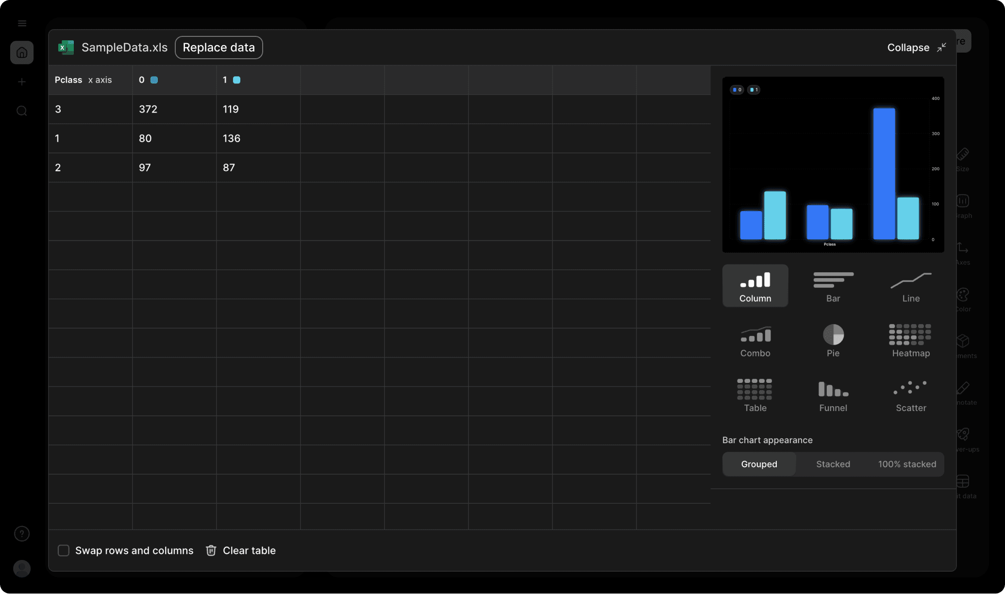
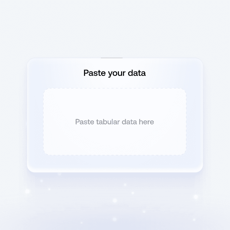
1. Upload or paste your data
Add your data by typing directly into the data table or copying from tools like Google Sheets or Excel. Graphy even supports connecting to Google Sheets directly for data syncing.

2. Customize the design
Personalize your heatmap with themes, custom colors, and powerful annotations to highlight key insights. Add elements like headline numbers, trend lines, and goal markers to make your data more meaningful and engaging.


3. Invite your coworkers to collaborate
Share your heatmap projects with team members for real-time collaboration and feedback. Give your colleagues access to view, edit, and contribute to your visualizations.

4. Export or embed your heatmap
Present your data live with a beautiful presenter mode or share your heatmap through interactive embeds in tools like Notion, Canva, or ClickUp. Export high-quality versions of your charts as images for use in presentations or reports.

How to make a heatmap online for free with Graphy

Spreadsheet import
Import directly from Excel, Google Sheets, or CSV files. Drag and drop your files or connect your cloud storage.
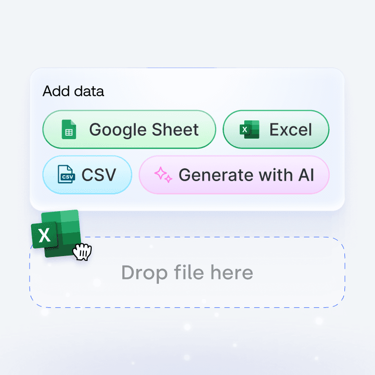

Direct input
Copy and paste data directly from any source. Smart parsing automatically detects your table structure.

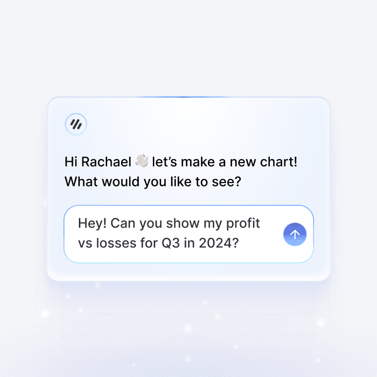
AI assistant
Describe the graph you want in plain English. AI helps format your data and suggests the best visualization.
All you need to turn an Excel sheet into a stunning, interactive graph
Wall of love
Trusted by 300,000+ data storytellers

Cindy Ibanez
Global Head of Marketing at Wynwood House
Thanks to Graphy 5 days of reporting were done in 4 hours.
My team were in love! They were like, oh my God, what is this, this is the future!

Joe Edwards
Senior Growth Marketing Manager at Venafi
Most other data tools are passive and leave it up to the stakeholders to interpret the numbers
Graphy helps you create stunning charts from disparate sources with the context and commentary your stakeholders need.

Stan Massueras
General Manager at Lattice
Great ideas are only impactful when communicated clearly.
Graphy enabled us to transform data into compelling stories, and those stories into meaningful action.

Ryan Hoover
Founder of Product Hunt
I’d rather eat cardboard than create another pivot table Thanks, Graphy (I don’t like cardboard)

Nick Lafferty
Founder at Early Exit Club
Graphy is the first tool I use when I'm looking to quickly create stunning visuals for my newsletter, social feeds, and my consulting business. I'm not stuck using Google Sheet's terrible default graphs anymore!

Liam Shalon
Director of Research and
Development at Level Ventures
Most of the BI/internal tools we have for generating reports suck so bad that it’s embarrassing. Graphy is one of the few tools in the space for visualizing data that ‘just works’.

Joe Tyndall
Head of Finance at Seedcamp
Few things get me as excited as beautiful charts do. Graphy has transformed the way we work with data for both internal and external content.
Effortless dashboards all in one place, and the AI features mean we can now produce them rapidly, and keep them updated live.

Neil Gandhi
Founder of Send.co
Graphy creates all my external facing charts.
AI does all the heavy work, and it’s drop dead gorgeous

Michael Cockburn
Founder of Desana
It was a complete game changer when Graphy started to allow me to prompt it for insights, fine tune them, and make beautiful visualizations out the other side.
Feels like the future of storytelling in business.

Mitchell Croft
Finance Director at Made Thought
Switched from presenting boring excel tables to using Graphy

Tim Chong
Co-founder and CEO at Yonder
Graphy has been game changing in helping our team build beautiful graphs without the hassle of formatting in Excel.
We use it for our internal reporting and board memos, it's super easy to make graphs in seconds.

Felix Kuhlmann
Analyst at Antler
Graphy helps me to make sense of our data from multiple sources in one place.

Jakob Knutzen
CEO & Co-Founder at Butter
Graphy allows me to make beautiful, super customized charts. This makes my communications of numbers to both investors and team much clearer.
Plus it's just fun to use 😊

Guillermo Rauch
CEO at Vercel
Stunning product.

David Jarvis
Founder/CEO at Griffin
I’ve been waiting for something like Graphy for nearly twenty years.
Beautiful, insightful, and dead easy to use. I’m obsessed.
Graphy's rating is
on

Wall of love
Trusted by 300,000+ data storytellers
Cindy Ibanez
Global Head of Marketing at Wynwood House
Thanks to Graphy 5 days of reporting were done in 4 hours.
My team were in love! They were like, oh my God, what is this, this is the future!
Joe Edwards
Senior Growth Marketing Manager at Venafi
Most other data tools are passive and leave it up to the stakeholders to interpret the numbers
Graphy helps you create stunning charts from disparate sources with the context and commentary your stakeholders need.
Stan Massueras
General Manager at Lattice
Great ideas are only impactful when communicated clearly.
Graphy enabled us to transform data into compelling stories, and those stories into meaningful action.
Ryan Hoover
Founder of Product Hunt
I’d rather eat cardboard than create another pivot table Thanks, Graphy (I don’t like cardboard)
Nick Lafferty
Founder at Early Exit Club
Graphy is the first tool I use when I'm looking to quickly create stunning visuals for my newsletter, social feeds, and my consulting business. I'm not stuck using Google Sheet's terrible default graphs anymore!
Liam Shalon
Director of Research and
Development at Level Ventures
Most of the BI/internal tools we have for generating reports suck so bad that it’s embarrassing. Graphy is one of the few tools in the space for visualizing data that ‘just works’.
Joe Tyndall
Head of Finance at Seedcamp
Few things get me as excited as beautiful charts do. Graphy has transformed the way we work with data for both internal and external content.
Effortless dashboards all in one place, and the AI features mean we can now produce them rapidly, and keep them updated live.
Neil Gandhi
Founder of Send.co
Graphy creates all my external facing charts.
AI does all the heavy work, and it’s drop dead gorgeous
Michael Cockburn
Founder of Desana
It was a complete game changer when Graphy started to allow me to prompt it for insights, fine tune them, and make beautiful visualizations out the other side.
Feels like the future of storytelling in business.
Mitchell Croft
Finance Director at Made Thought
Switched from presenting boring excel tables to using Graphy
Tim Chong
Co-founder and CEO at Yonder
Graphy has been game changing in helping our team build beautiful graphs without the hassle of formatting in Excel.
We use it for our internal reporting and board memos, it's super easy to make graphs in seconds.
Felix Kuhlmann
Analyst at Antler
Graphy helps me to make sense of our data from multiple sources in one place.
Jakob Knutzen
CEO & Co-Founder at Butter
Graphy allows me to make beautiful, super customized charts. This makes my communications of numbers to both investors and team much clearer.
Plus it's just fun to use 😊
Guillermo Rauch
CEO at Vercel
Stunning product.
David Jarvis
Founder/CEO at Griffin
I’ve been waiting for something like Graphy for nearly twenty years.
Beautiful, insightful, and dead easy to use. I’m obsessed.
Graphy's rating is
on


So many ways to visualise your Excel sheet
FAQ
How can I turn a table into a graph?
In Excel, you select your data range, go to the Insert tab, and pick a chart type from the Charts group. But honestly, Excel's default charts look pretty bland and take forever to make presentable. With Graphy, you can just paste your Excel data directly or upload your sheet, and it instantly creates professional-looking charts that actually tell a story. Plus, Graphy's AI can even suggest the best chart type and highlight key insights automatically.
How to create a bar graph in Excel?
Select your data, hit Insert > Bar Chart, then choose between clustered, stacked, or 100% stacked bars. Excel gives you basic bars, but they're pretty ugly out of the box and you'll spend ages tweaking colors and formatting. Graphy creates stunning bar charts instantly with smart defaults, beautiful color schemes, and you can add annotations or highlights to focus attention on what matters most - no fiddling with formatting required.
How to create a line chart in Excel?
Highlight your data, go to Insert > Line Chart, and pick your style (with or without markers). Excel's line charts work fine for basic stuff, but they look dated and it's a pain to make them presentation-ready. Graphy makes gorgeous line charts that are actually shareable - you can add trend lines, goals, and visual storytelling elements with one click, plus they look great in Slack, presentations, or wherever you need to share them.
How do I format a chart in Excel?
Right-click elements to format them, use the Chart Tools tabs, or the Format pane to adjust colors, fonts, axes, and titles. It's honestly a nightmare of nested menus and takes forever to make anything look decent. On the other hand, Graphy handles all the formatting automatically with beautiful, modern designs that just work. You spend your time focusing on insights instead of wrestling with font sizes and color palettes - and everything looks professional by default.
The AI Graph Maker
From messy data to beautiful graphs in a click, Graphy is the fastest way to tell stories with data.
Graphs
All graphs
Backed by
Coatue
General Catalyst
Northzone
Seedcamp
Graphy Technologies Ltd. 2025. All rights reserved
The AI Graph Maker
From messy data to beautiful graphs in a click, Graphy is the fastest way to tell stories with data.
Graphs
All graphs
Backed by
Coatue
General Catalyst
Northzone
Seedcamp
Graphy Technologies Ltd. 2025. All rights reserved
The AI Graph Maker
From messy data to beautiful graphs in a click, Graphy is the fastest way to tell stories with data.
Graphs
All graphs
Backed by
Coatue
General Catalyst
Northzone
Seedcamp
Graphy Technologies Ltd. 2025. All rights reserved
The AI Graph Maker
From messy data to beautiful graphs in a click, Graphy is the fastest way to tell stories with data.
Graphs
All graphs
Backed by
Coatue
General Catalyst
Northzone
Seedcamp
Graphy Technologies Ltd. 2025. All rights reserved