Free horizontal bar graph maker
Design stunning, interactive horizontal bar graphs that highlight your data’s storyin seconds — no design skills needed.
No credit card required
No credit card required


Use cases
When to use a horizontal bar graph
Horizontal bar graphs outshine their vertical cousins when you're working with long category labels or numerous data points. While vertical charts can become cramped and illegible, horizontal bars give your labels room to breathe and are perfect for comparing 8 or more items at once.


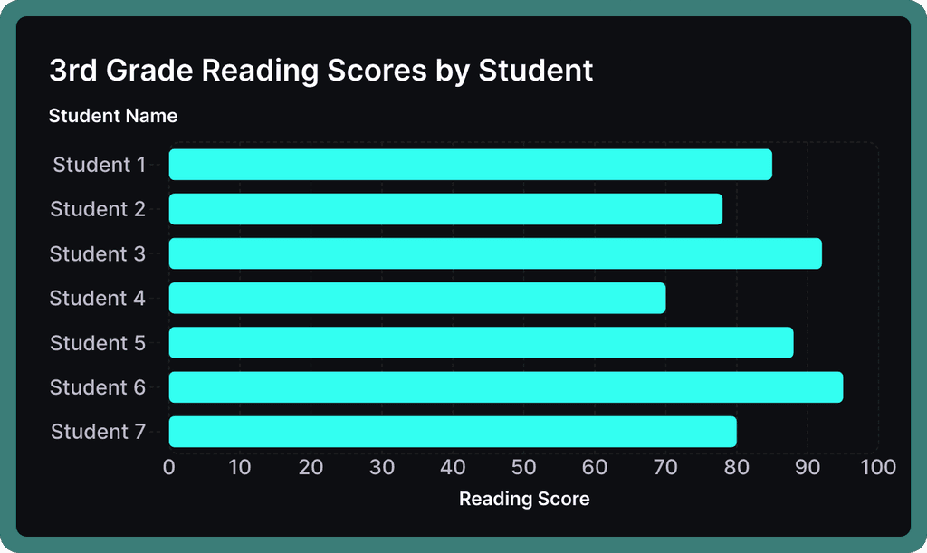
Compare Categories
When you have departments, products, or regions with detailed names to compare, horizontal bars let you display each label clearly on the left while the bars extend right. No more tilted or truncated labels that plague vertical charts.
When you have departments, products, or regions with detailed names to compare, horizontal bars let you display each label clearly on the left while the bars extend right. No more tilted or truncated labels that plague vertical charts.
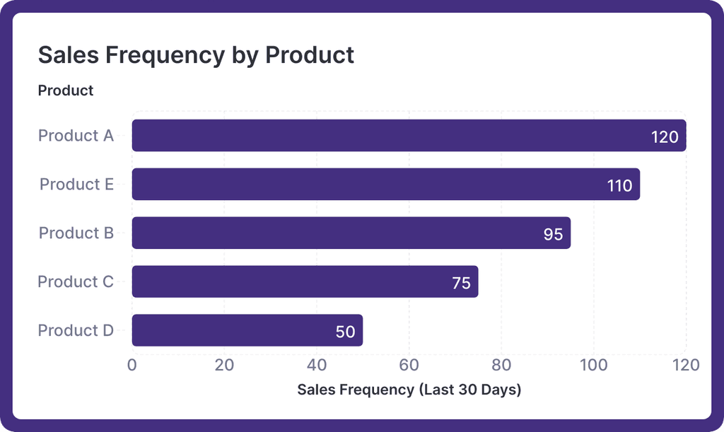
Rank Performance
Perfect for showing how different items rank against each other, from employee satisfaction scores across offices to sales figures by product line. The horizontal format naturally guides the eye from highest to lowest.
Perfect for showing how different items rank against each other, from employee satisfaction scores across offices to sales figures by product line. The horizontal format naturally guides the eye from highest to lowest.
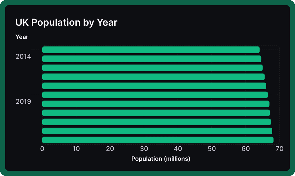
Track Progress Over Time
Monitor how metrics change across weeks, months, or years. The horizontal format excels at showing progression and makes it easy to spot trends.
Monitor how metrics change across weeks, months, or years. The horizontal format excels at showing progression and makes it easy to spot trends.


Horizontal bar graph templates
Start with one of our pre-made palettes or create a
horizontal bar graph from scratch.

1. Upload or paste your data
Add your data by typing directly into the data table or copying from tools like Google Sheets or Excel. Graphy even supports connecting to Google Sheets directly for data syncing.

2. Customize the design
Personalize your horizontal bar graph with themes, custom colors, and powerful annotations to highlight key insights. Add elements like headline numbers, trend lines, and goal markers to make your data more meaningful and engaging.


3. Invite your coworkers to collaborate
Share your horizontal bar graph projects with team members for real-time collaboration and feedback. Give your colleagues access to view, edit, and contribute to your visualizations.

4. Export or embed your horizontal bar graph
Present your data live with a beautiful presenter mode or share your horizontal bar graph through interactive embeds in tools like Notion, Canva, or ClickUp. Export high-quality versions of your charts as images for use in presentations or reports.

How to make a horizontal bar graph online for free with Graphy
How to easily make a horizontal bar graph online for free with Graphy
Wall of love
Trusted by 300,000+ data storytellers

Cindy Ibanez
Global Head of Marketing at Wynwood House
Thanks to Graphy 5 days of reporting were done in 4 hours.
My team were in love! They were like, oh my God, what is this, this is the future!

Joe Edwards
Senior Growth Marketing Manager at Venafi
Most other data tools are passive and leave it up to the stakeholders to interpret the numbers
Graphy helps you create stunning charts from disparate sources with the context and commentary your stakeholders need.

Stan Massueras
General Manager at Lattice
Great ideas are only impactful when communicated clearly.
Graphy enabled us to transform data into compelling stories, and those stories into meaningful action.

Ryan Hoover
Founder of Product Hunt
I’d rather eat cardboard than create another pivot table Thanks, Graphy (I don’t like cardboard)

Nick Lafferty
Founder at Early Exit Club
Graphy is the first tool I use when I'm looking to quickly create stunning visuals for my newsletter, social feeds, and my consulting business. I'm not stuck using Google Sheet's terrible default graphs anymore!

Liam Shalon
Director of Research and
Development at Level Ventures
Most of the BI/internal tools we have for generating reports suck so bad that it’s embarrassing. Graphy is one of the few tools in the space for visualizing data that ‘just works’.

Joe Tyndall
Head of Finance at Seedcamp
Few things get me as excited as beautiful charts do. Graphy has transformed the way we work with data for both internal and external content.
Effortless dashboards all in one place, and the AI features mean we can now produce them rapidly, and keep them updated live.

Neil Gandhi
Founder of Send.co
Graphy creates all my external facing charts.
AI does all the heavy work, and it’s drop dead gorgeous

Michael Cockburn
Founder of Desana
It was a complete game changer when Graphy started to allow me to prompt it for insights, fine tune them, and make beautiful visualizations out the other side.
Feels like the future of storytelling in business.

Mitchell Croft
Finance Director at Made Thought
Switched from presenting boring excel tables to using Graphy

Tim Chong
Co-founder and CEO at Yonder
Graphy has been game changing in helping our team build beautiful graphs without the hassle of formatting in Excel.
We use it for our internal reporting and board memos, it's super easy to make graphs in seconds.

Felix Kuhlmann
Analyst at Antler
Graphy helps me to make sense of our data from multiple sources in one place.

Jakob Knutzen
CEO & Co-Founder at Butter
Graphy allows me to make beautiful, super customized charts. This makes my communications of numbers to both investors and team much clearer.
Plus it's just fun to use 😊

Guillermo Rauch
CEO at Vercel
Stunning product.

David Jarvis
Founder/CEO at Griffin
I’ve been waiting for something like Graphy for nearly twenty years.
Beautiful, insightful, and dead easy to use. I’m obsessed.
Graphy's rating is
on

Wall of love
Trusted by 300,000+ data storytellers
Cindy Ibanez
Global Head of Marketing at Wynwood House
Thanks to Graphy 5 days of reporting were done in 4 hours.
My team were in love! They were like, oh my God, what is this, this is the future!
Joe Edwards
Senior Growth Marketing Manager at Venafi
Most other data tools are passive and leave it up to the stakeholders to interpret the numbers
Graphy helps you create stunning charts from disparate sources with the context and commentary your stakeholders need.
Stan Massueras
General Manager at Lattice
Great ideas are only impactful when communicated clearly.
Graphy enabled us to transform data into compelling stories, and those stories into meaningful action.
Ryan Hoover
Founder of Product Hunt
I’d rather eat cardboard than create another pivot table Thanks, Graphy (I don’t like cardboard)
Nick Lafferty
Founder at Early Exit Club
Graphy is the first tool I use when I'm looking to quickly create stunning visuals for my newsletter, social feeds, and my consulting business. I'm not stuck using Google Sheet's terrible default graphs anymore!
Liam Shalon
Director of Research and
Development at Level Ventures
Most of the BI/internal tools we have for generating reports suck so bad that it’s embarrassing. Graphy is one of the few tools in the space for visualizing data that ‘just works’.
Joe Tyndall
Head of Finance at Seedcamp
Few things get me as excited as beautiful charts do. Graphy has transformed the way we work with data for both internal and external content.
Effortless dashboards all in one place, and the AI features mean we can now produce them rapidly, and keep them updated live.
Neil Gandhi
Founder of Send.co
Graphy creates all my external facing charts.
AI does all the heavy work, and it’s drop dead gorgeous
Michael Cockburn
Founder of Desana
It was a complete game changer when Graphy started to allow me to prompt it for insights, fine tune them, and make beautiful visualizations out the other side.
Feels like the future of storytelling in business.
Mitchell Croft
Finance Director at Made Thought
Switched from presenting boring excel tables to using Graphy
Tim Chong
Co-founder and CEO at Yonder
Graphy has been game changing in helping our team build beautiful graphs without the hassle of formatting in Excel.
We use it for our internal reporting and board memos, it's super easy to make graphs in seconds.
Felix Kuhlmann
Analyst at Antler
Graphy helps me to make sense of our data from multiple sources in one place.
Jakob Knutzen
CEO & Co-Founder at Butter
Graphy allows me to make beautiful, super customized charts. This makes my communications of numbers to both investors and team much clearer.
Plus it's just fun to use 😊
Guillermo Rauch
CEO at Vercel
Stunning product.
David Jarvis
Founder/CEO at Griffin
I’ve been waiting for something like Graphy for nearly twenty years.
Beautiful, insightful, and dead easy to use. I’m obsessed.
Graphy's rating is
on
It's not just horizontal bar graphs - you can create all sorts of charts


It's not just horizontal bar graphs - you can create all sorts of charts
It's not just horizontal bar graphs - you can create all sorts of charts
It's not just horizontal bar graphs - you can create all sorts of charts
FAQ
What does a horizontal bar graph compare?
Horizontal bar graphs excel at comparing values across different categories, like sales across regions or satisfaction scores across departments. They're especially powerful when you need to compare many items at once or when your category names are lengthy.
What are the advantages of a horizontal bar graph?
The biggest wins of horizontal bars are their ability to display long category labels clearly and handle many data points without becoming cluttered. They're also ideal for ranking data since we naturally read from top to bottom, making it easy to spot the highest and lowest performers.
What are the disadvantages of using horizontal bar charts?
Horizontal bar charts can take up more vertical space than their vertical counterparts, making them tricky to fit when you have limited height. They're also not the best choice when tracking continuous data over time - that's where line graphs shine.
What is the difference between vertical and horizontal bar graphs?
While both show the same type of data, vertical bars work better for fewer categories and shorter labels, while horizontal bars excel with longer labels and more categories. Think of vertical bars as your go-to for comparing up to 7 items, while horizontal bars handle 8 or more with ease.
What is the difference between a histogram and a horizontal bar chart?
A histogram shows the distribution of continuous data in adjacent bars representing ranges (like age groups or price bands), while horizontal bar charts compare discrete, separate categories. Unlike histograms, horizontal bar charts can have gaps between bars since each represents a distinct category.
The AI Graph Maker
From messy data to beautiful graphs in a click, Graphy is the fastest way to tell stories with data.
Graphs
All graphs
Backed by
Coatue
General Catalyst
Northzone
Seedcamp
Graphy Technologies Ltd. 2025. All rights reserved
The AI Graph Maker
From messy data to beautiful graphs in a click, Graphy is the fastest way to tell stories with data.
Graphs
All graphs
Backed by
Coatue
General Catalyst
Northzone
Seedcamp
Graphy Technologies Ltd. 2025. All rights reserved
The AI Graph Maker
From messy data to beautiful graphs in a click, Graphy is the fastest way to tell stories with data.
Graphs
All graphs
Backed by
Coatue
General Catalyst
Northzone
Seedcamp
Graphy Technologies Ltd. 2025. All rights reserved
The AI Graph Maker
From messy data to beautiful graphs in a click, Graphy is the fastest way to tell stories with data.
Graphs
All graphs
Backed by
Coatue
General Catalyst
Northzone
Seedcamp
Graphy Technologies Ltd. 2025. All rights reserved