Free heatmap maker
From messy data to beautiful graphs in a click.
Graphy is the fastest way to tell stories with data.


Heatmap templates
Start with one of our pre-made palettes or create a heatmap from scratch.


FAQ
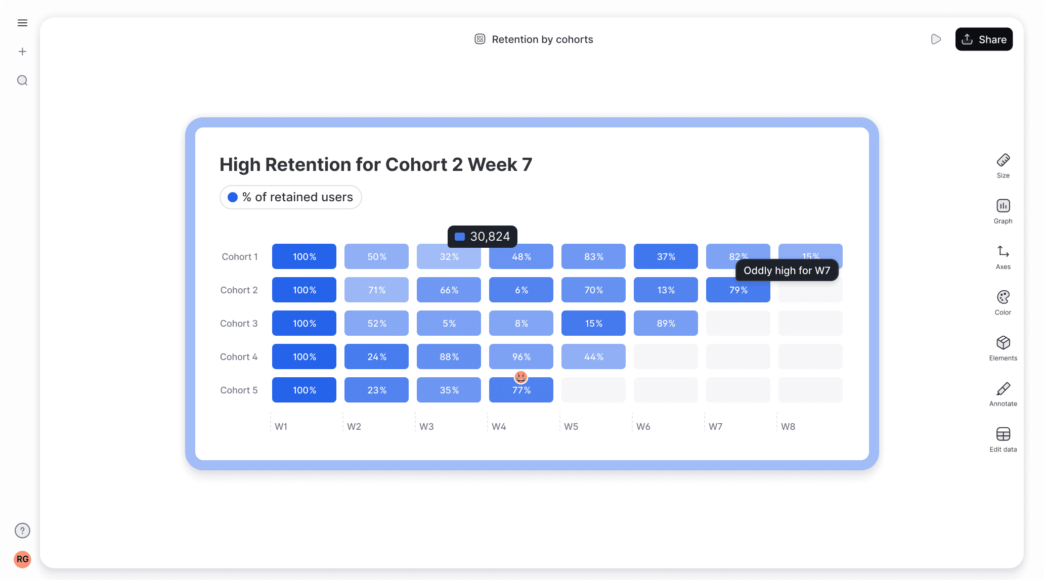
How to visualize cohort analysis?
The easiest way to visualize cohort analysis is to create a retention heatmap, which shows how differentThe easiest way to visualize cohort analysis is to create a retention heatmap, which shows how different user groups behave over time using color gradients. A free tool like Graphy lets you simply paste your cohort data and instantly generates an interactive heatmap where darker colors represent higher retention rates. You can customize the colors, add annotations, collaborate with others, and export your visualization with just a few clicks. user groups behave over time using color gradients. A free tool like Graphy lets you simply paste your cohort data and instantly generates an interactive heatmap where darker colors represent higher retention rates. You can customize the colors, add annotations, collaborate with others, and export your visualization with just a few clicks.
What is the best graph to show retention rate?
A heatmap is the most effective visualization for retention rates since it uses color intensity to show patterns across cohorts and time periods at a glance. You can quickly create a retention heatmap for free using Graphy by simply pasting your data - no coding required. The darker colors instantly highlight which user groups have the highest retention, making it easy to spot trends and share insights with your team.
What are the best colors for a heatmap?
Single-color gradients like blue or purple work best for heatmaps since they’re colorblind-friendly and make it easy to spot patterns - darker shades naturally draw attention to higher values. Graphy automatically applies an accessible blue gradient to your heatmap, though you can easily customize the colors to match your brand.
What is the difference between a heatmap and a treemap?
A heatmap uses color intensity to show relationships between variables (like retention over time), while a treemap uses differently sized rectangles to represent hierarchical data proportions. For retention analysis and cohort data, heatmaps are the better choice - which you can create instantly for free using Graphy with just a simple data paste. While treemaps are great for showing part-to-whole relationships, heatmaps excel at revealing patterns across multiple dimensions.
Is Graphy heatmap maker really free?
Yes, absolutely! Creating heatmaps is free, and you can share them with anyone. Upgrade to Plus to remove watermarks, use AI features, and unlock more customizations such as colors.
How do I add my data to a heatmap?
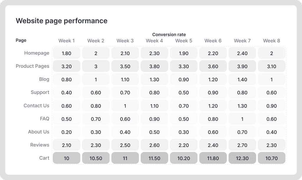
Creating charts on Graphy is incredibly simple. When you select a chart type, you'll see a template data structure in the table, showing you how to format your data. You can add your data by copying and pasting, uploading CSV or XLS files, or connecting a Google Sheet.