Graph maker with trendline
Design a stunning, interactive graph with a trendline that illuminates your data's direction in an instant — no design skills needed.
No credit card required
No credit card required


Use cases
When to use a graph with a trendline
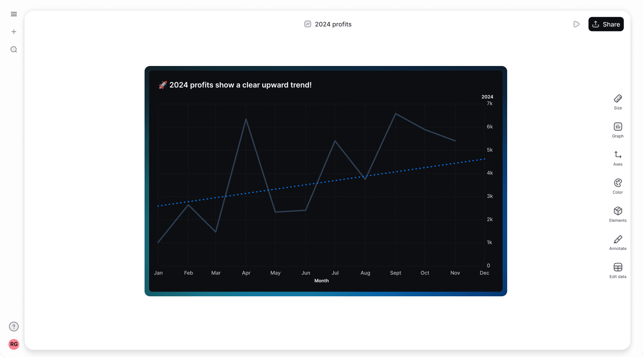
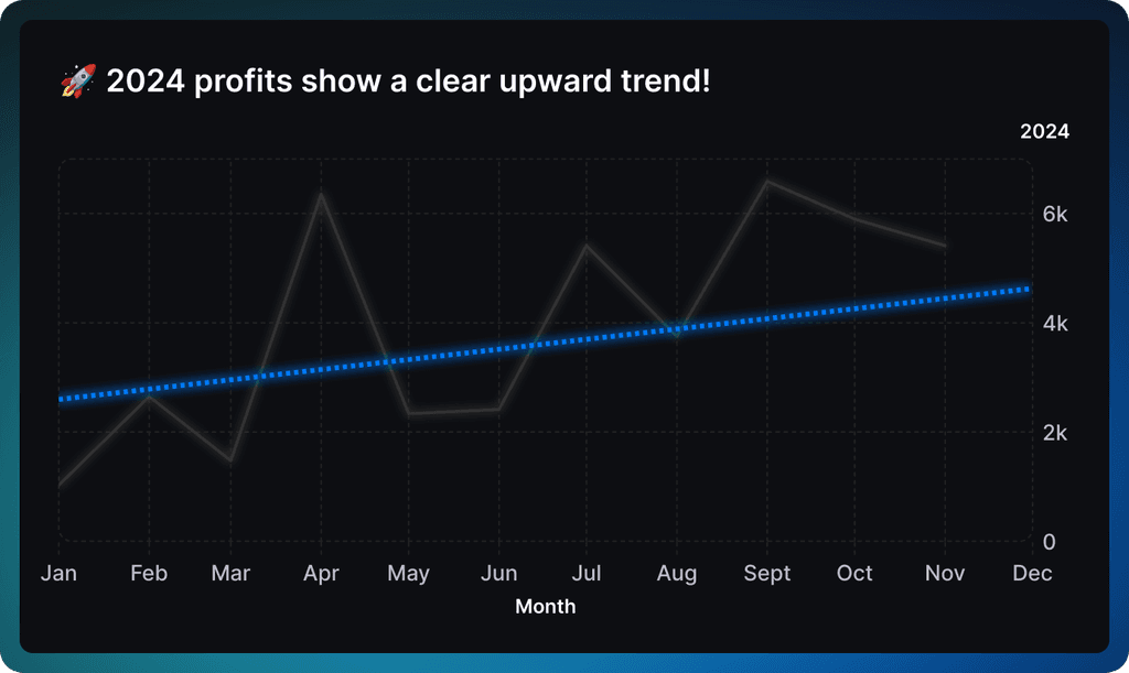
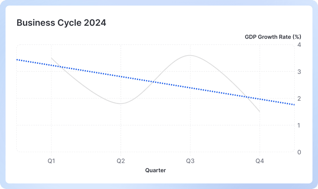
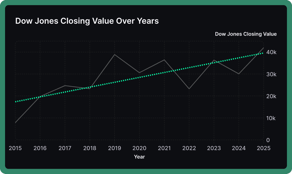
Graphs with trendlines cut through the noise to reveal the true direction of your data over time.


Spot Overall Direction
A trendline shows the general trajectory of your data – whether your sales are growing, website traffic is declining, or costs are staying flat despite day-to-day variations.
A trendline shows the general trajectory of your data – whether your sales are growing, website traffic is declining, or costs are staying flat despite day-to-day variations.
Compare Rate of Change
Understand how quickly your numbers are changing. The steeper your trendline, the faster the growth or decline – helping you quickly gauge if your monthly revenue is growing faster or slower than last year.
Understand how quickly your numbers are changing. The steeper your trendline, the faster the growth or decline – helping you quickly gauge if your monthly revenue is growing faster or slower than last year.
Project Future Values
Use your trendline to get a rough idea of where your numbers are headed. If the current trend continues, estimate what your user count, expenses, or other metrics might look like in the coming months.
Use your trendline to get a rough idea of where your numbers are headed. If the current trend continues, estimate what your user count, expenses, or other metrics might look like in the coming months.


Graph with trendline templates
Start with one of our pre-made palettes or create a
line graph from scratch.
Start with one of our pre-made palettes or create a
line graph with multiple lines from scratch.
1. Upload or paste your data
Add your data by typing directly into the data table or copying from tools like Google Sheets or Excel. Graphy even supports connecting to Google Sheets directly for data syncing.

2. Customize the design
Personalize your graph with trendline with themes, custom colors, and powerful annotations to highlight key insights. Add elements like headline numbers, trend lines, and goal markers to make your data more meaningful and engaging.


3. Invite your coworkers to collaborate
Share your graph with trendlineprojects with team members for real-time collaboration and feedback. Give your colleagues access to view, edit, and contribute to your visualizations.

4. Export or embed your graph with trendline
Present your data live with a beautiful presenter mode or share your line graph through interactive embeds in tools like Notion, Canva, or ClickUp. Export high-quality versions of your charts as images for use in presentations or reports.

How to make a graph with trendline online for free with Graphy
How to easily make a graph with a trendline online for free with Graphy
Wall of love
Trusted by 300,000+ data storytellers

Cindy Ibanez
Global Head of Marketing at Wynwood House
Thanks to Graphy 5 days of reporting were done in 4 hours.
My team were in love! They were like, oh my God, what is this, this is the future!

Joe Edwards
Senior Growth Marketing Manager at Venafi
Most other data tools are passive and leave it up to the stakeholders to interpret the numbers
Graphy helps you create stunning charts from disparate sources with the context and commentary your stakeholders need.

Stan Massueras
General Manager at Lattice
Great ideas are only impactful when communicated clearly.
Graphy enabled us to transform data into compelling stories, and those stories into meaningful action.

Ryan Hoover
Founder of Product Hunt
I’d rather eat cardboard than create another pivot table Thanks, Graphy (I don’t like cardboard)

Nick Lafferty
Founder at Early Exit Club
Graphy is the first tool I use when I'm looking to quickly create stunning visuals for my newsletter, social feeds, and my consulting business. I'm not stuck using Google Sheet's terrible default graphs anymore!

Liam Shalon
Director of Research and
Development at Level Ventures
Most of the BI/internal tools we have for generating reports suck so bad that it’s embarrassing. Graphy is one of the few tools in the space for visualizing data that ‘just works’.

Joe Tyndall
Head of Finance at Seedcamp
Few things get me as excited as beautiful charts do. Graphy has transformed the way we work with data for both internal and external content.
Effortless dashboards all in one place, and the AI features mean we can now produce them rapidly, and keep them updated live.

Neil Gandhi
Founder of Send.co
Graphy creates all my external facing charts.
AI does all the heavy work, and it’s drop dead gorgeous

Michael Cockburn
Founder of Desana
It was a complete game changer when Graphy started to allow me to prompt it for insights, fine tune them, and make beautiful visualizations out the other side.
Feels like the future of storytelling in business.

Mitchell Croft
Finance Director at Made Thought
Switched from presenting boring excel tables to using Graphy

Tim Chong
Co-founder and CEO at Yonder
Graphy has been game changing in helping our team build beautiful graphs without the hassle of formatting in Excel.
We use it for our internal reporting and board memos, it's super easy to make graphs in seconds.

Felix Kuhlmann
Analyst at Antler
Graphy helps me to make sense of our data from multiple sources in one place.

Jakob Knutzen
CEO & Co-Founder at Butter
Graphy allows me to make beautiful, super customized charts. This makes my communications of numbers to both investors and team much clearer.
Plus it's just fun to use 😊

Guillermo Rauch
CEO at Vercel
Stunning product.

David Jarvis
Founder/CEO at Griffin
I’ve been waiting for something like Graphy for nearly twenty years.
Beautiful, insightful, and dead easy to use. I’m obsessed.
Graphy's rating is
on

Wall of love
Trusted by 300,000+ data storytellers
Cindy Ibanez
Global Head of Marketing at Wynwood House
Thanks to Graphy 5 days of reporting were done in 4 hours.
My team were in love! They were like, oh my God, what is this, this is the future!
Joe Edwards
Senior Growth Marketing Manager at Venafi
Most other data tools are passive and leave it up to the stakeholders to interpret the numbers
Graphy helps you create stunning charts from disparate sources with the context and commentary your stakeholders need.
Stan Massueras
General Manager at Lattice
Great ideas are only impactful when communicated clearly.
Graphy enabled us to transform data into compelling stories, and those stories into meaningful action.
Ryan Hoover
Founder of Product Hunt
I’d rather eat cardboard than create another pivot table Thanks, Graphy (I don’t like cardboard)
Nick Lafferty
Founder at Early Exit Club
Graphy is the first tool I use when I'm looking to quickly create stunning visuals for my newsletter, social feeds, and my consulting business. I'm not stuck using Google Sheet's terrible default graphs anymore!
Liam Shalon
Director of Research and
Development at Level Ventures
Most of the BI/internal tools we have for generating reports suck so bad that it’s embarrassing. Graphy is one of the few tools in the space for visualizing data that ‘just works’.
Joe Tyndall
Head of Finance at Seedcamp
Few things get me as excited as beautiful charts do. Graphy has transformed the way we work with data for both internal and external content.
Effortless dashboards all in one place, and the AI features mean we can now produce them rapidly, and keep them updated live.
Neil Gandhi
Founder of Send.co
Graphy creates all my external facing charts.
AI does all the heavy work, and it’s drop dead gorgeous
Michael Cockburn
Founder of Desana
It was a complete game changer when Graphy started to allow me to prompt it for insights, fine tune them, and make beautiful visualizations out the other side.
Feels like the future of storytelling in business.
Mitchell Croft
Finance Director at Made Thought
Switched from presenting boring excel tables to using Graphy
Tim Chong
Co-founder and CEO at Yonder
Graphy has been game changing in helping our team build beautiful graphs without the hassle of formatting in Excel.
We use it for our internal reporting and board memos, it's super easy to make graphs in seconds.
Felix Kuhlmann
Analyst at Antler
Graphy helps me to make sense of our data from multiple sources in one place.
Jakob Knutzen
CEO & Co-Founder at Butter
Graphy allows me to make beautiful, super customized charts. This makes my communications of numbers to both investors and team much clearer.
Plus it's just fun to use 😊
Guillermo Rauch
CEO at Vercel
Stunning product.
David Jarvis
Founder/CEO at Griffin
I’ve been waiting for something like Graphy for nearly twenty years.
Beautiful, insightful, and dead easy to use. I’m obsessed.
Graphy's rating is
on
It's not just graphs with trendlines - you can create all sorts of graphs


It's not just graphs with trendlines - you can create all sorts of graphs
It's not just graphs with trendlines - you can create all sorts of graphs
It's not just graphs with trendlines - you can create all sorts of graphs
FAQ
How do you draw a trend line on a graph?
Drawing a trend line is super simple - use the free online tool Graphy to do it automatically when you click the trend line option. The line gets calculated using something called "least squares regression" (fancy math!) to find the best fit through your data points. Just add your data and we'll handle the rest.
How to calculate the trend line for a graph?
Behind the scenes, we use linear regression to find the line that best fits your data points. This means minimizing the distance between your actual data points and the line we draw through them. Don't worry though - you don't need to know any of that math since we handle all the calculations automatically.
What does a horizontal trend line mean?
A horizontal trend line (one that's flat) means your data isn't really changing over time - it's staying steady. For example, if your monthly sales have a horizontal trend line, you're consistently selling about the same amount each month, even if there are small ups and downs. This can be good or bad depending on your goals!
What is the difference between a trendline and a regression line?
They're actually the same thing - just different names! A regression line is the more technical/statistical term, while trendline is the more common everyday name. Both describe that straight line that shows the overall direction your data is heading.
How do you know if a trendline is significant?
A significant trendline means the pattern you're seeing isn't just random chance - there's likely a real trend in your data. While there are statistical tests for this (like R-squared values), the easiest way to tell is if your line clearly shows an upward or downward pattern that matches what you see in the data points.
The AI Graph Maker
From messy data to beautiful graphs in a click, Graphy is the fastest way to tell stories with data.
Graphs
All graphs
Backed by
Coatue
General Catalyst
Northzone
Seedcamp
Graphy Technologies Ltd. 2025. All rights reserved
The AI Graph Maker
From messy data to beautiful graphs in a click, Graphy is the fastest way to tell stories with data.
Graphs
All graphs
Backed by
Coatue
General Catalyst
Northzone
Seedcamp
Graphy Technologies Ltd. 2025. All rights reserved
The AI Graph Maker
From messy data to beautiful graphs in a click, Graphy is the fastest way to tell stories with data.
Graphs
All graphs
Backed by
Coatue
General Catalyst
Northzone
Seedcamp
Graphy Technologies Ltd. 2025. All rights reserved
The AI Graph Maker
From messy data to beautiful graphs in a click, Graphy is the fastest way to tell stories with data.
Graphs
All graphs
Backed by
Coatue
General Catalyst
Northzone
Seedcamp
Graphy Technologies Ltd. 2025. All rights reserved