Free donut chart maker
Design stunning, interactive donut charts that highlight your data’s story in seconds — no design skills needed.
No credit card required
No credit card required


Donut chart templates
Start with one of our pre-made palettes or create a donut chart from scratch.
1. Upload or paste your data
Add your data by typing directly into the data table or copying from tools like Google Sheets or Excel. Graphy even supports connecting to Google Sheets directly for data syncing.

2. Customize the design
Personalize your donut chart with themes, custom colors, and powerful annotations to highlight key insights. Add elements like headline numbers, trend lines, and goal markers to make your data more meaningful and engaging.


3. Invite your coworkers to collaborate
Share your donut projects with team members for real-time collaboration and feedback. Give your colleagues access to view, edit, and contribute to your visualizations.

4. Export or embed your donut chart
Present your data live with a beautiful presenter mode or share your pie chart through interactive embeds in tools like Notion, Canva, or ClickUp. Export high-quality versions of your charts as images for use in presentations or reports.

How to make a donut chart online for free with Graphy
How to make a donut chart online for free with Graphy
Wall of love
Trusted by 300,000+ data storytellers

Cindy Ibanez
Global Head of Marketing at Wynwood House
Thanks to Graphy 5 days of reporting were done in 4 hours.
My team were in love! They were like, oh my God, what is this, this is the future!

Joe Edwards
Senior Growth Marketing Manager at Venafi
Most other data tools are passive and leave it up to the stakeholders to interpret the numbers
Graphy helps you create stunning charts from disparate sources with the context and commentary your stakeholders need.

Stan Massueras
General Manager at Lattice
Great ideas are only impactful when communicated clearly.
Graphy enabled us to transform data into compelling stories, and those stories into meaningful action.

Ryan Hoover
Founder of Product Hunt
I’d rather eat cardboard than create another pivot table Thanks, Graphy (I don’t like cardboard)

Nick Lafferty
Founder at Early Exit Club
Graphy is the first tool I use when I'm looking to quickly create stunning visuals for my newsletter, social feeds, and my consulting business. I'm not stuck using Google Sheet's terrible default graphs anymore!

Liam Shalon
Director of Research and
Development at Level Ventures
Most of the BI/internal tools we have for generating reports suck so bad that it’s embarrassing. Graphy is one of the few tools in the space for visualizing data that ‘just works’.

Joe Tyndall
Head of Finance at Seedcamp
Few things get me as excited as beautiful charts do. Graphy has transformed the way we work with data for both internal and external content.
Effortless dashboards all in one place, and the AI features mean we can now produce them rapidly, and keep them updated live.

Neil Gandhi
Founder of Send.co
Graphy creates all my external facing charts.
AI does all the heavy work, and it’s drop dead gorgeous

Michael Cockburn
Founder of Desana
It was a complete game changer when Graphy started to allow me to prompt it for insights, fine tune them, and make beautiful visualizations out the other side.
Feels like the future of storytelling in business.

Mitchell Croft
Finance Director at Made Thought
Switched from presenting boring excel tables to using Graphy

Tim Chong
Co-founder and CEO at Yonder
Graphy has been game changing in helping our team build beautiful graphs without the hassle of formatting in Excel.
We use it for our internal reporting and board memos, it's super easy to make graphs in seconds.

Felix Kuhlmann
Analyst at Antler
Graphy helps me to make sense of our data from multiple sources in one place.

Jakob Knutzen
CEO & Co-Founder at Butter
Graphy allows me to make beautiful, super customized charts. This makes my communications of numbers to both investors and team much clearer.
Plus it's just fun to use 😊

Guillermo Rauch
CEO at Vercel
Stunning product.

David Jarvis
Founder/CEO at Griffin
I’ve been waiting for something like Graphy for nearly twenty years.
Beautiful, insightful, and dead easy to use. I’m obsessed.
Graphy's rating is
on

Wall of love
Trusted by 300,000+ data storytellers
Cindy Ibanez
Global Head of Marketing at Wynwood House
Thanks to Graphy 5 days of reporting were done in 4 hours.
My team were in love! They were like, oh my God, what is this, this is the future!
Joe Edwards
Senior Growth Marketing Manager at Venafi
Most other data tools are passive and leave it up to the stakeholders to interpret the numbers
Graphy helps you create stunning charts from disparate sources with the context and commentary your stakeholders need.
Stan Massueras
General Manager at Lattice
Great ideas are only impactful when communicated clearly.
Graphy enabled us to transform data into compelling stories, and those stories into meaningful action.
Ryan Hoover
Founder of Product Hunt
I’d rather eat cardboard than create another pivot table Thanks, Graphy (I don’t like cardboard)
Nick Lafferty
Founder at Early Exit Club
Graphy is the first tool I use when I'm looking to quickly create stunning visuals for my newsletter, social feeds, and my consulting business. I'm not stuck using Google Sheet's terrible default graphs anymore!
Liam Shalon
Director of Research and
Development at Level Ventures
Most of the BI/internal tools we have for generating reports suck so bad that it’s embarrassing. Graphy is one of the few tools in the space for visualizing data that ‘just works’.
Joe Tyndall
Head of Finance at Seedcamp
Few things get me as excited as beautiful charts do. Graphy has transformed the way we work with data for both internal and external content.
Effortless dashboards all in one place, and the AI features mean we can now produce them rapidly, and keep them updated live.
Neil Gandhi
Founder of Send.co
Graphy creates all my external facing charts.
AI does all the heavy work, and it’s drop dead gorgeous
Michael Cockburn
Founder of Desana
It was a complete game changer when Graphy started to allow me to prompt it for insights, fine tune them, and make beautiful visualizations out the other side.
Feels like the future of storytelling in business.
Mitchell Croft
Finance Director at Made Thought
Switched from presenting boring excel tables to using Graphy
Tim Chong
Co-founder and CEO at Yonder
Graphy has been game changing in helping our team build beautiful graphs without the hassle of formatting in Excel.
We use it for our internal reporting and board memos, it's super easy to make graphs in seconds.
Felix Kuhlmann
Analyst at Antler
Graphy helps me to make sense of our data from multiple sources in one place.
Jakob Knutzen
CEO & Co-Founder at Butter
Graphy allows me to make beautiful, super customized charts. This makes my communications of numbers to both investors and team much clearer.
Plus it's just fun to use 😊
Guillermo Rauch
CEO at Vercel
Stunning product.
David Jarvis
Founder/CEO at Griffin
I’ve been waiting for something like Graphy for nearly twenty years.
Beautiful, insightful, and dead easy to use. I’m obsessed.
Graphy's rating is
on
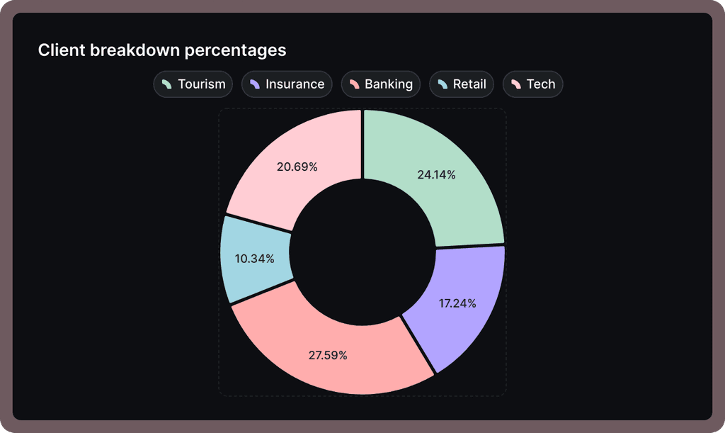
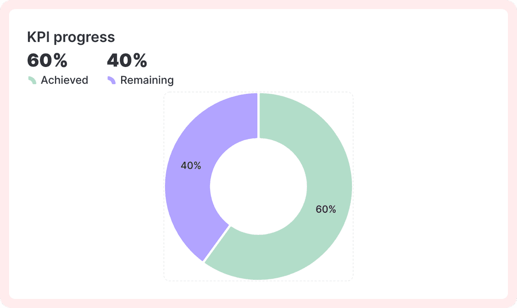
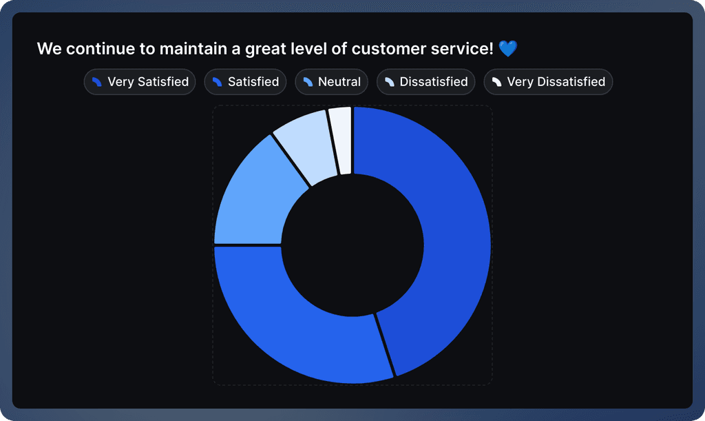
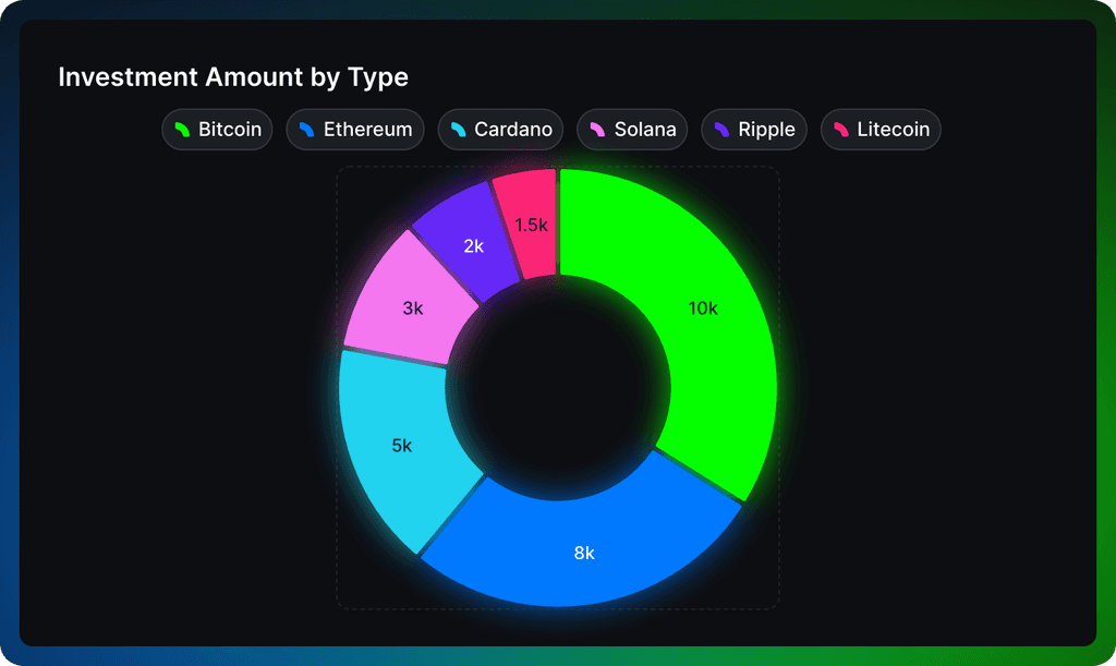
It's not just donut charts - you can create all sorts of charts


It's not just donut charts - you can create all sorts of charts
It's not just donut charts - you can create all sorts of charts
It's not just donut charts - you can create all sorts of charts
FAQ
What is the difference between a pie chart and a donut chart?
A donut chart is basically a pie chart with a hole in the middle - that's really the only difference! While they show the same data, many people find donut charts more modern and easier to read. Plus, that empty space in the middle is perfect for adding a key number or label to highlight your main point.
How do you turn a pie chart into a donut chart?
It's super easy in Graphy - when you're making a chart, first select Pie from the Chart Type menu, then look for the "Pie chart appearance" setting just below. Simply click "Donut chart" instead of "Pie chart" and you're all set! You can also customize your donut by toggling data labels and percentages on or off using the Style options.
How to make a good donut chart?
Keep it clean and simple - try to show no more than 5-6 categories max for best readability. Use contrasting colors that work well together, and consider ordering your segments from largest to smallest.
When not to use a donut chart?
Skip the donut chart if you're comparing more than 6 categories - it gets pretty hard to read at that point. Also, if your segments are very similar in size or you need to make precise comparisons between values, you might want to go with a bar chart instead. Donut charts are best for showing simple part-to-whole relationships.
The AI Graph Maker
From messy data to beautiful graphs in a click, Graphy is the fastest way to tell stories with data.
Graphs
All graphs
Backed by
Coatue
General Catalyst
Northzone
Seedcamp
Graphy Technologies Ltd. 2025. All rights reserved
The AI Graph Maker
From messy data to beautiful graphs in a click, Graphy is the fastest way to tell stories with data.
Graphs
All graphs
Backed by
Coatue
General Catalyst
Northzone
Seedcamp
Graphy Technologies Ltd. 2025. All rights reserved
The AI Graph Maker
From messy data to beautiful graphs in a click, Graphy is the fastest way to tell stories with data.
Graphs
All graphs
Backed by
Coatue
General Catalyst
Northzone
Seedcamp
Graphy Technologies Ltd. 2025. All rights reserved
The AI Graph Maker
From messy data to beautiful graphs in a click, Graphy is the fastest way to tell stories with data.
Graphs
All graphs
Backed by
Coatue
General Catalyst
Northzone
Seedcamp
Graphy Technologies Ltd. 2025. All rights reserved