Free Mekko chart maker
Design stunning, interactive mekko charts that highlight your data’s story in seconds — no design skills needed.








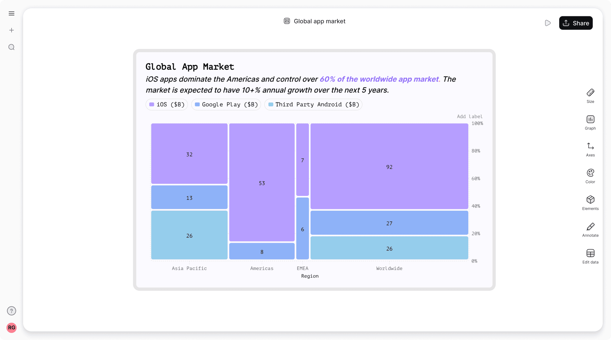
Mekko chart templates
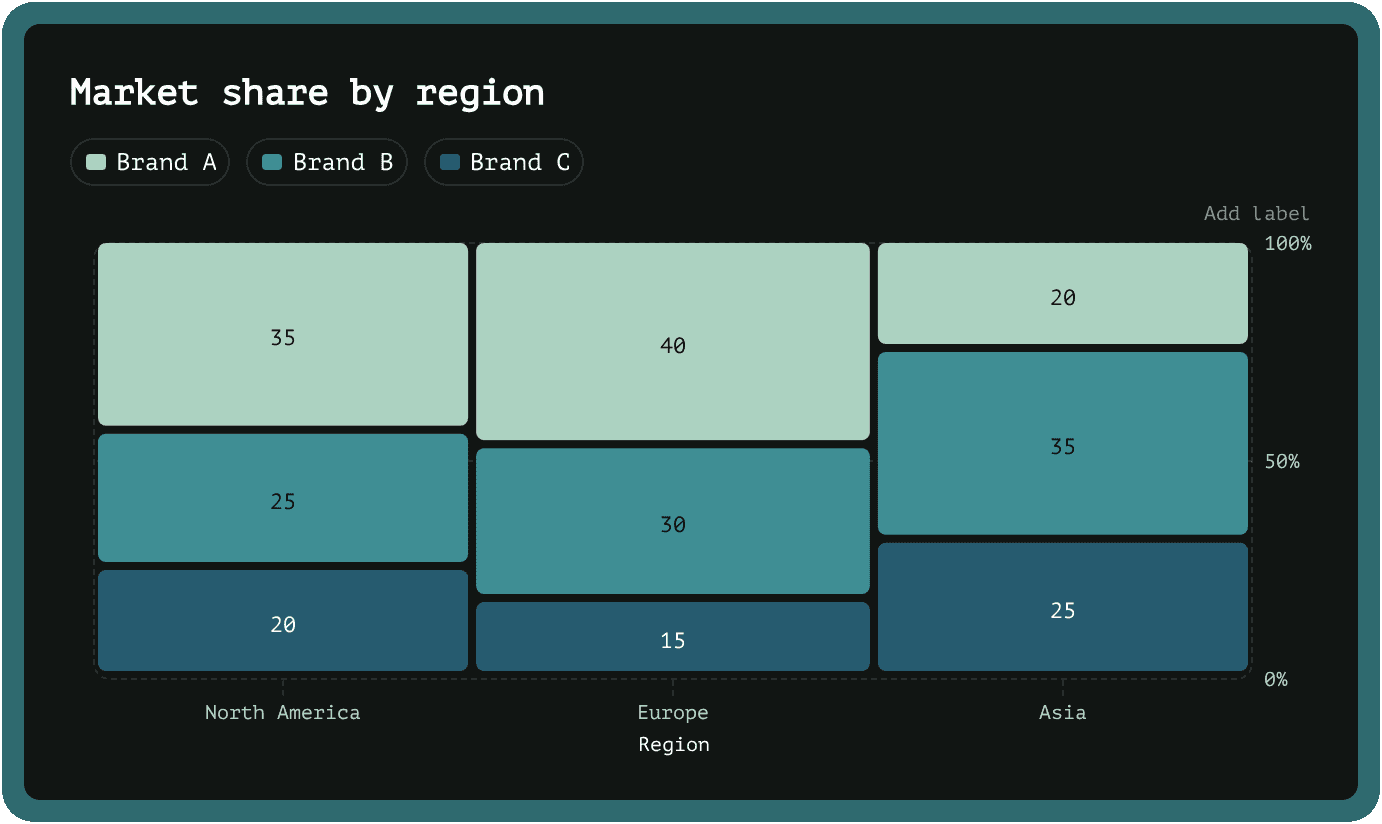
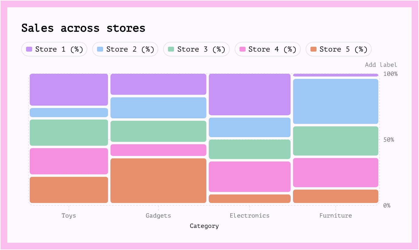
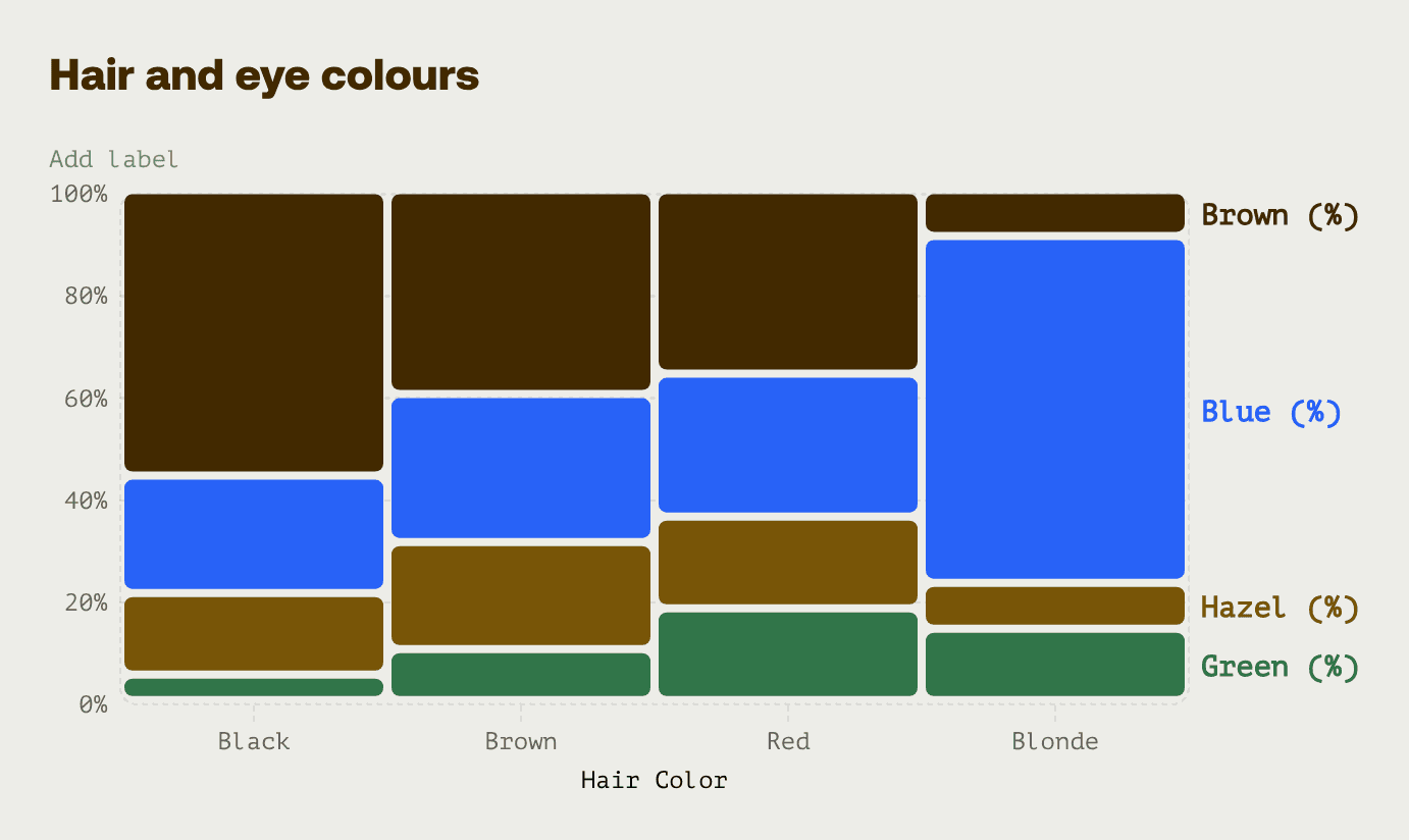
Start with one of our pre-made palettes or create a Mekko chart from scratch.




























FAQ
What is the difference between a treemap and a Mekko chart?
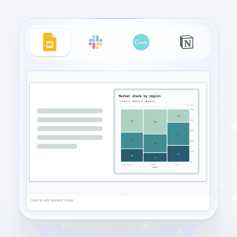
A treemap uses nested rectangles of different sizes to show hierarchical data, where each rectangle's area represents a value and smaller rectangles sit inside larger category boxes. A Mekko chart (also called a marimekko chart) displays data using variable-width columns, where both the width and height of each segment convey information—making it perfect for showing two dimensions at once, like market share by segment and category size. The key difference is that treemaps are great for showing part-to-whole relationships in a hierarchy, while Mekko charts excel at comparing distributions across categories where both the category sizes and internal breakdowns matter.
When should I use a Mekko chart? Are Mekko charts good for presentations?
Use a Mekko chart when you need to show how something is divided across categories that themselves vary in size—like comparing how different market segments are split by product type, or how various departments allocate their budgets. They're excellent for presentations because they pack a lot of information into one visual without feeling cluttered, helping executives and stakeholders quickly grasp complex market dynamics or competitive positioning at a glance, which is why they're so popular in consulting and business strategy decks.
How do I make a Mekko chart in PowerPoint?
Creating a Mekko chart in PowerPoint is pretty tedious since there's no built-in template—you'd need to manually create and position individual rectangles or stacked bar charts, then carefully adjust widths and heights to match your data proportions, which is time-consuming and prone to errors. Here's the good news: it's way easier and better to use Graphy to create your Mekko chart instead, since Graphy lets you input your data and automatically generates a professional, accurate chart that you can customize and drop right into your presentation, saving hours of manual work.
Why is it called a Marimekko chart?
The chart is named after Marimekko, the famous Finnish textile and design company known for its bold, colorful patterns featuring blocks of different sizes and colors. The chart's visual style—with its variable-width columns and stacked segments—resembles the distinctive geometric fabric prints that made Marimekko iconic in the 1960s, and the name stuck.
Can I create a Mekko chart with code instead of the visual editor?
Yes. With Graphy's chart API you can describe your Mekko chart in code (your data plus how you want it to look) and render it in your own app. Don't want to write that yourself? Just describe the Mekko chart you want in plain English to our Agents API, and it'll generate it for you, ready to render.