Free clustered chart maker

From messy data to beautiful graphs in a click.
Graphy is the fastest way to tell stories with data.

Best free clustered chart maker

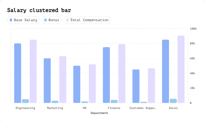
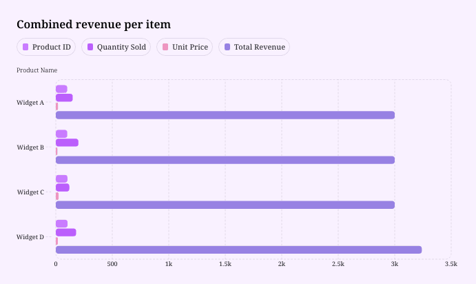
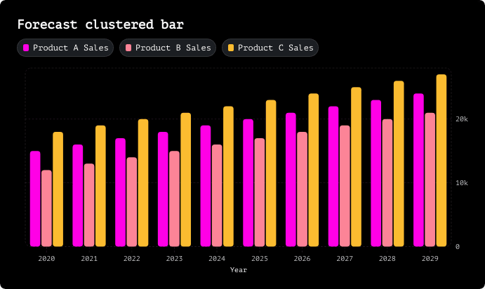
Clustered bar chart templates

Start with one of our pre-made palettes or create a clustered bar chart from scratch.

  • Salary clustered bar chart
  • Sales clustered bar chart
  • Forecast clustered bar chart
  • Salary clustered bar chart
  • Sales clustered bar chart
  • Forecast clustered bar chart

1. Upload or paste your data

Add your data by typing directly into the data table or copying from tools like Google Sheets or Excel. Graphy even supports connecting to Google Sheets directly for data syncing.

Upload or paste your data

2. Customize the design

Personalize your clustered bar chart with themes, custom colors, and powerful annotations to highlight key insights. Add elements like headline numbers, trend lines, and goal markers to make your data more meaningful and engaging.

Customize the design and add annotations

3. Invite your coworkers to collaborate

Share your clustered bar chart projects with team members for real-time collaboration and feedback. Give your colleagues access to view, edit, and contribute to your visualizations.

Invite your coworkers to collaborate

4. Export or embed your clustered bar chart

Present your data live with a beautiful presenter mode or share your clustered bar chart through interactive embeds in tools like Notion, Canva, or ClickUp. Export high-quality versions of your charts as images for use in presentations or reports.

Export or embed your heat map

How to make a clustered bar chart online for free with Graphy

How to make a clustered bar chart online for free with Graphy

Upload or paste your data

Wall of love

Trusted by 300,000+ data storytellers

  • Cindy Ibanez

    Global Head of Marketing at Wynwood House

    Thanks to Graphy 5 days of reporting were done in 4 hours.

    My team were in love! They were like, oh my God, what is this, this is the future!

  • Joe Edwards

    Senior Growth Marketing Manager at Venafi

    Most other data tools are passive and leave it up to the stakeholders to interpret the numbers

    Graphy helps you create stunning charts from disparate sources with the context and commentary your stakeholders need.

  • Stan Massueras

    General Manager at Lattice

    Great ideas are only impactful when communicated clearly.

    Graphy enabled us to transform data into compelling stories, and those stories into meaningful action.

  • Ryan Hoover

    Founder of Product Hunt

    I’d rather eat cardboard than create another pivot table Thanks, Graphy (I don’t like cardboard)

  • Nick Lafferty

    Founder at Early Exit Club

    Graphy is the first tool I use when I'm looking to quickly create stunning visuals for my newsletter, social feeds, and my consulting business. I'm not stuck using Google Sheet's terrible default graphs anymore!

  • Liam Shalon

    Director of Research and

    Development at Level Ventures

    Most of the BI/internal tools we have for generating reports suck so bad that it’s embarrassing. Graphy is one of the few tools in the space for visualizing data that ‘just works’.

  • Joe Tyndall

    Head of Finance at Seedcamp

    Few things get me as excited as beautiful charts do. Graphy has transformed the way we work with data for both internal and external content.


    Effortless dashboards all in one place, and the AI features mean we can now produce them rapidly, and keep them updated live.

  • Neil Gandhi

    Founder of Send.co

    Graphy creates all my external facing charts.


    AI does all the heavy work, and it’s drop dead gorgeous

  • Michael Cockburn

    Founder of Desana

    It was a complete game changer when Graphy started to allow me to prompt it for insights, fine tune them, and make beautiful visualizations out the other side.

    Feels like the future of storytelling in business.

  • Mitchell Croft

    Finance Director at Made Thought

    Switched from presenting boring excel tables to using Graphy

  • Tim Chong

    Co-founder and CEO at Yonder

    Graphy has been game changing in helping our team build beautiful graphs without the hassle of formatting in Excel.


    We use it for our internal reporting and board memos, it's super easy to make graphs in seconds.

  • Felix Kuhlmann

    Analyst at Antler

    Graphy helps me to make sense of our data from multiple sources in one place.

  • Jakob Knutzen

    CEO & Co-Founder at Butter

    Graphy allows me to make beautiful, super customized charts. This makes my communications of numbers to both investors and team much clearer.


    Plus it's just fun to use 😊

  • Guillermo Rauch

    CEO at Vercel

    Stunning product.

  • David Jarvis

    Founder/CEO at Griffin

    I’ve been waiting for something like Graphy for nearly twenty years.


    Beautiful, insightful, and dead easy to use. I’m obsessed.

Graphy's rating is

on

FAQ

What is the difference between stacked and clustered charts?

Stacked charts pile data series on top of each other to show cumulative totals, making it easy to see the overall sum and how each part contributes to the whole. Clustered charts (also called grouped charts) place bars side-by-side for each category, which is perfect when you want to directly compare individual values across different groups. Think of it this way: use stacked when you care about the total, and use clustered when you want to spotlight the differences between specific data points.

What are the advantages of a clustered column chart?

Clustered column charts make direct comparisons incredibly easy since all the bars start from the same baseline. You can quickly spot which category performs best in each group and identify trends across multiple data series at a glance. They're also super intuitive—most people can understand them instantly without needing a legend tutorial. Plus, they prevent the visual confusion that can happen with stacked charts when you're trying to compare values that aren't at the bottom of the stack.

What is a drawback of using a clustered column chart?

The main downside of clustered column charts is they can get visually cluttered fast, especially when you're dealing with many categories or data series—suddenly you've got a forest of bars that's hard to read. They also don't show cumulative totals, so if you need to communicate the overall sum across categories, you're out of luck. And when you have tons of groups to display, the bars can become so narrow and cramped that comparing them accurately becomes nearly impossible.

What is the best alternative to a clustered bar chart?

If clustered bars aren't working for you, stacked bar charts are the go-to alternative when you want to show composition and totals. For comparing trends over time, line charts usually tell a clearer story. When you're dealing with lots of categories, a heatmap can reveal patterns that bars would obscure. And if you're feeling overwhelmed by the choices, tools like Graphy can analyze your data and automatically suggest the best chart type—then create a beautiful, customized visualization in seconds using AI.

How to create a clustered bar chart in Excel?

To create a clustered bar chart in Excel, select your data, go to the Insert tab, click on the Bar Chart icon, and choose "Clustered Bar." Excel will generate a basic chart that you can then customize with titles, colors, and labels. But honestly, Excel's default charts can look pretty dated and require a lot of manual formatting to make them presentation-ready. That's where Graphy comes in—just upload your data (CSV, Excel, or even link a Google Sheet), and Graphy's AI automatically creates stunning, professionally designed clustered bar charts that are ready to drop into slides, docs, or social posts in seconds, no formatting headaches required.